biolovers.site/yourname. Everything below is fully optional — even a brand-new account is already a usable page.
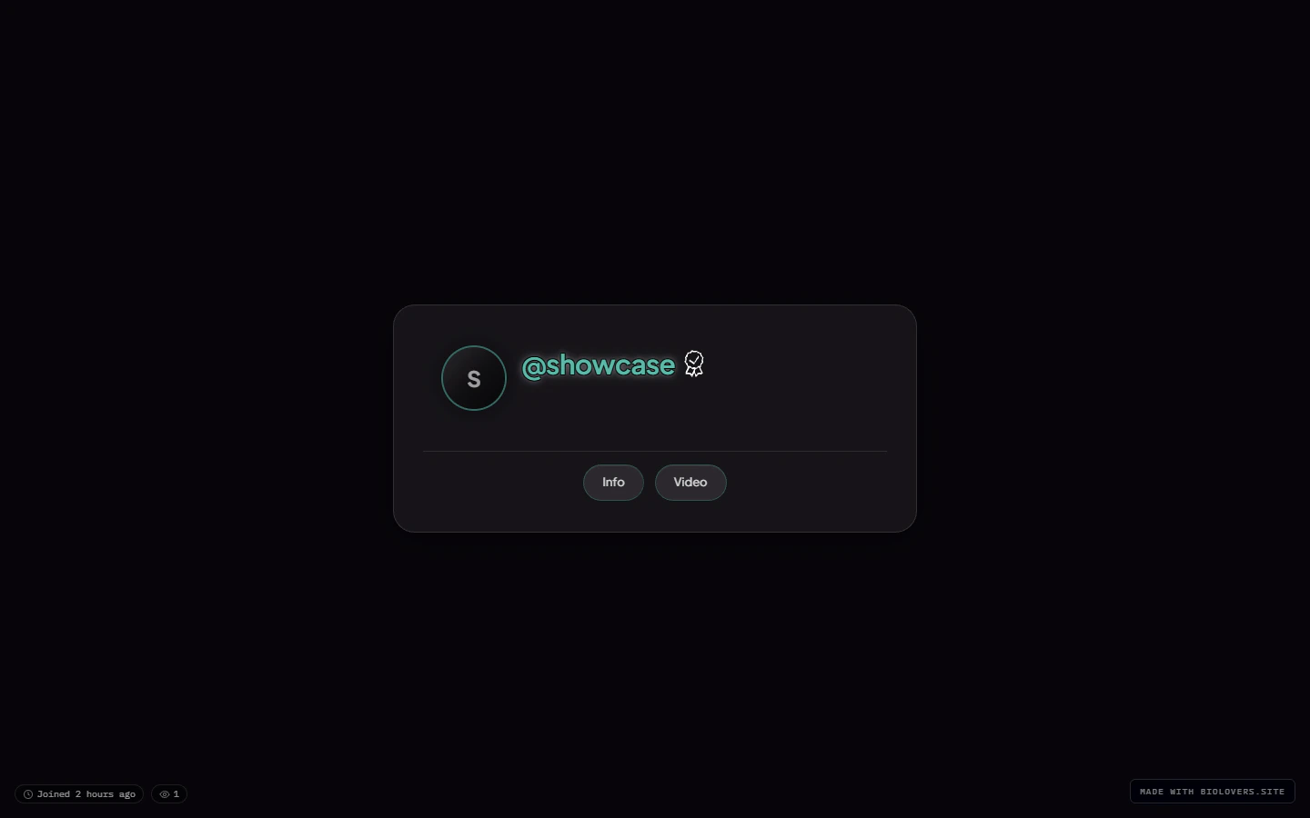
A profile (the showcase account) on desktop.
Layered structure (back to front)
- Page background — image / video / color. See Page background.
- Audio player bar (optional) — pinned to the viewport bottom by default; can be docked inside the card or moved to a gap below it. See Audio player.
- Profile card — the main rectangle.
- Avatar at the top.
- Display name + badges below.
- @handle row (with optional UID popover).
- Stats line (views, joined, location, timezone).
- Bio (markdown).
- Social link chips (icon row).
- Live tiles (Spotify, YouTube, Steam, Discord, …).
- Widgets (gear shelf button, embed cards, infobox text, portfolio grid, Steam inventory button, gaming settings cards).
- Watermark at the bottom (free tier only).
- Custom cursor (optional) — replaces the visitor’s mouse arrow. See Custom cursor.
- Splash (optional) — overlays the whole thing on first load. See Splash screen.
Mobile

Same profile on mobile.