Page on the dashboard: dashboard.biolovers.site/dashboard/edit/look/card-layout
Card layout panel.
Structure layout
Tap one of the four preset cards. Each preset is a complete starting point.
Picking a preset doesn’t lock anything — you can override the individual controls below.
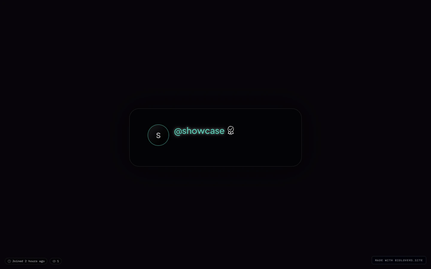
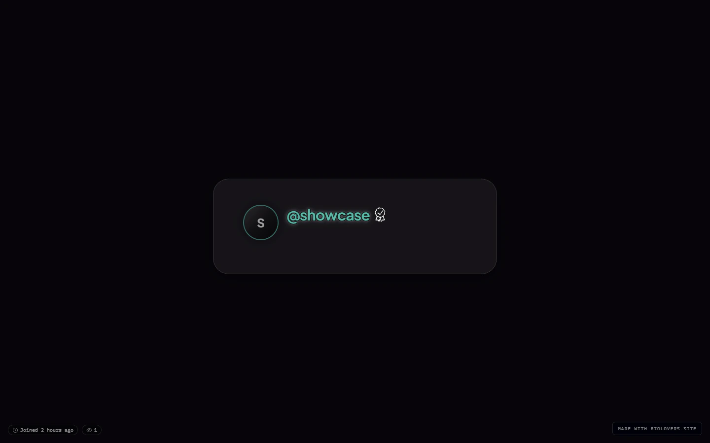
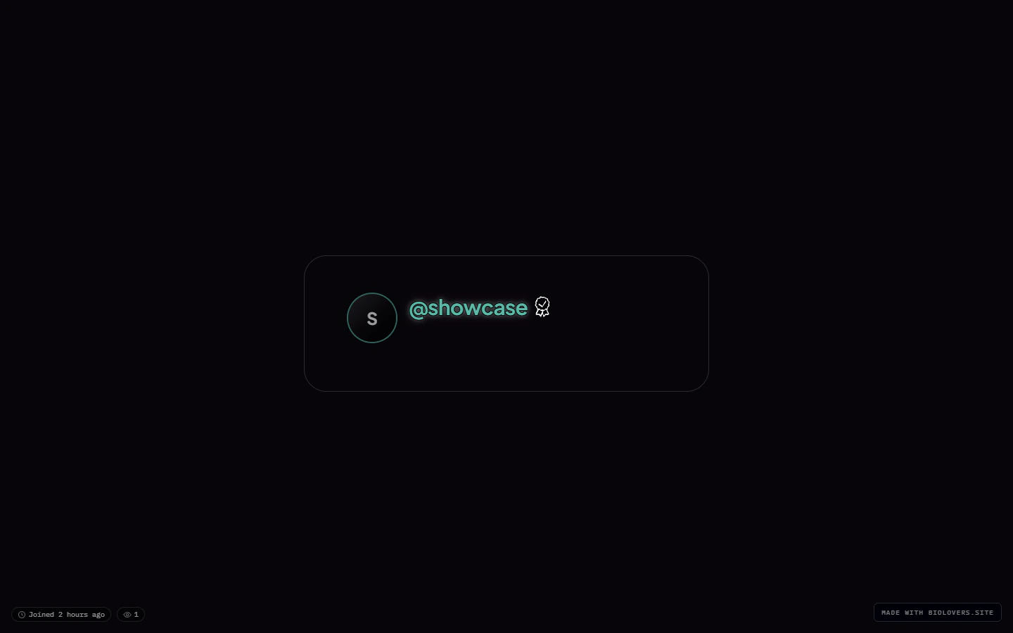
Side-by-side: the four presets on the showcase profile

Default (showcase profile, no other changes).

Modern.
Simplistic.

Sleek.
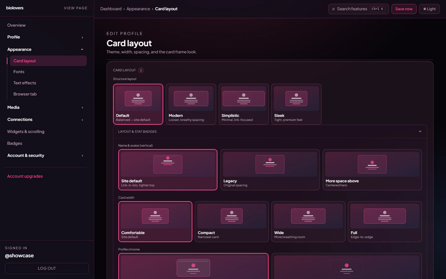
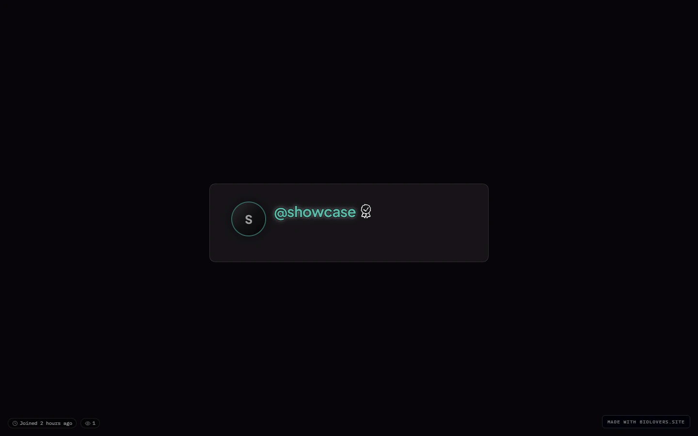
Name & avatar (vertical)
Three options for how the hero (avatar + name) sits inside the card:Card width
Four discrete sizes — not a slider: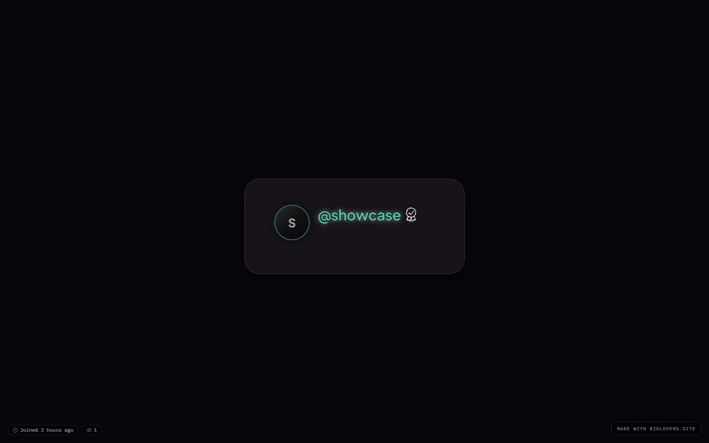
Compact.

Comfortable (default).

Wide.
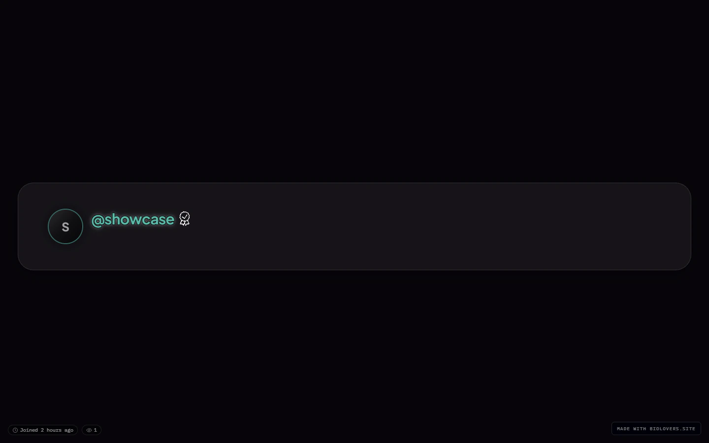
Full.
Profile chrome
Two looks for the page-level chrome around your card:Card panel (the fill behind the card content)
Solid card panel.
Glass card panel.
Transparent card panel (Premium).
Glass & blur (Premium)
This collapsible group has two opt-in sliders:- Custom backdrop blur — checkbox to enable, then a slider from
0to40px. Off uses the preset’s default. - Custom panel opacity — checkbox to enable, then a percentage slider for how much of the page background bleeds through.
Where the accent color lives
Not on this panel. The accent color picker is on the Name & about me panel because it’s tied to text / link styling.Where the page background lives
Not on this panel either. See Page background for the image / video behind the card.Common questions
My card looks crowded
My card looks crowded
Switch the Card width to Wide or Full, or pick the Modern structure preset.
The blur is too much / too little
The blur is too much / too little
Open the Glass & blur group, tick Custom backdrop blur, and slide between 0 and 40 px. (Premium feature.)
I want my background to show through fully
I want my background to show through fully
Set Card panel to Transparent (Premium). Note that text legibility depends on the background — consider darkening the background or applying a Text effect outline.
Where do I change the page background itself?
Where do I change the page background itself?
Different panel — see Page background. Card layout is only the card frame.
Related
Page background
What’s behind the card.
Text effects
Gradient, glow, outline (Premium).