> ## Documentation Index
> Fetch the complete documentation index at: https://help.biolovers.site/llms.txt
> Use this file to discover all available pages before exploring further.
# Widgets overview
> Extra blocks on your profile — markdown infobox, embed, gear shelf, portfolio, Steam inventory, gaming settings, plus three legacy single-link types.
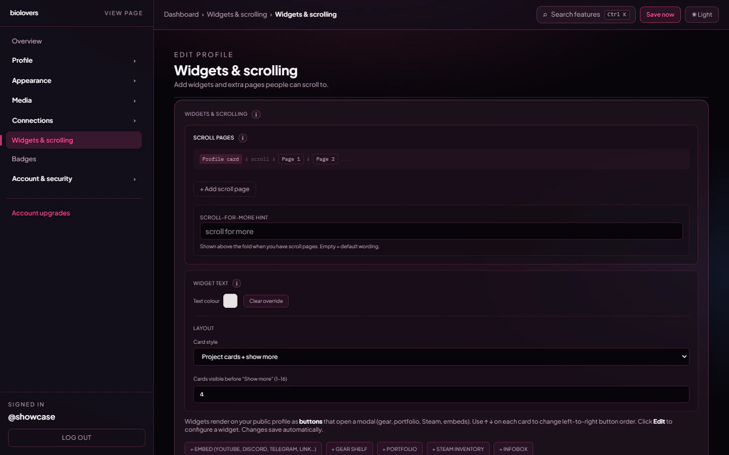
Page on the dashboard: dashboard.biolovers.site/dashboard/edit/pages/widgets
Widgets are the **extra blocks** on your profile beyond your bio and links. The schema accepts up to **16 widgets total** per profile.
 ## The widget types
The `profileWidgetSchema` is a union of **ten** widget shapes. Seven are first-class types you can add new instances of from the dashboard:
A formatted text block (markdown subset). Per-widget custom font.
Up to 12 mixed entries: YouTube videos, Discord invites, Telegram links, generic iframes, link buttons.
A "what I use" grid — up to 48 product cards.
Up to 60 images + 12 video clip URLs (YouTube, Twitch, Streamable, Kick).
Showcase dev projects — banner, description, a Visit button, and clickable tech badges.
Pull your CS2 / Dota 2 / TF2 inventory from Steam.
Per-game mouse sens + aspect ratio. Auto-fills from your config file (CS2, COD, BF2042, OW2, R6, …).
**Rainbow Six Siege:** show **rank** on [Connect → Live](/connections/social-integrations) and **sens** in [Gaming settings](/widgets/gaming-settings) — [full guide](/widgets/rainbow-six-siege).
The other three shapes — `telegram`, `discord_invite`, and `iframe` — are **legacy single-URL widgets** kept readable so older profiles still render. New widgets of these shapes get created as **entries** inside the unified Embed widget instead.
## How saving works
Widgets **autosave** on a \~900 ms debounce after every change. There is no Save button on this panel — when you stop typing / clicking, the change is persisted to the server. A spinner near the editor header indicates an in-flight save.
Validation runs on save. If the server rejects a widget (bad URL, missing image, etc.) the editor surfaces the error and the autosave retries after the next edit.
## Scroll-for-more pages
You can split widgets into multiple **scroll pages** stacked under your main card. Each widget has a `placement` of either `card` (inside the main profile card) or a section number `1`–`10` (one of the scroll pages).
* Up to **10 scroll pages** per profile (the editor enforces this).
* Each scroll page can have an optional title (max 80 chars).
* Mobile especially benefits from scroll pages — small screens fill up fast.
## Where each widget renders
Each widget has a `widgetItemChrome` (for grids of items) and a `widgetBodyChrome` (for prose / single-iframe shells), each one of `solid` / `transparent` / `glass` / `blur`. There is no "clean" chrome.
The **Embed** widget has two display modes:
* **Button mode** — each entry is a clickable card/pill that opens a modal.
* **Embed mode** — iframes / live embeds render inline.
The **Gear shelf** is special: in card placement it appears as a single button that opens a modal centered inside your card with all the items.
## Tips
* Lead with what you want people to look at. Widgets render top-to-bottom on desktop and on mobile.
* Big widgets (portfolio, embed grid) on **scroll page 2** keeps your main card lean.
* The **infobox** is great for an "About this profile" block at the bottom.
## Common questions
Widgets autosave \~1 second after you stop editing. If the save spinner doesn't go idle, check the editor banner for an error.
16 widgets per profile (`max(16)` on the customization schema). Each widget has its own internal limits — 12 embed entries, 48 gear shelf items, 60 portfolio images, etc.
Yes. Each one is a separate widget — useful for different sections.
The single-URL `iframe`, `discord_invite`, and `telegram` widget types are kept readable so existing profiles continue to render. The dashboard now creates these as **entries** inside the unified **Embed widget** instead.
## The widget types
The `profileWidgetSchema` is a union of **ten** widget shapes. Seven are first-class types you can add new instances of from the dashboard:
A formatted text block (markdown subset). Per-widget custom font.
Up to 12 mixed entries: YouTube videos, Discord invites, Telegram links, generic iframes, link buttons.
A "what I use" grid — up to 48 product cards.
Up to 60 images + 12 video clip URLs (YouTube, Twitch, Streamable, Kick).
Showcase dev projects — banner, description, a Visit button, and clickable tech badges.
Pull your CS2 / Dota 2 / TF2 inventory from Steam.
Per-game mouse sens + aspect ratio. Auto-fills from your config file (CS2, COD, BF2042, OW2, R6, …).
**Rainbow Six Siege:** show **rank** on [Connect → Live](/connections/social-integrations) and **sens** in [Gaming settings](/widgets/gaming-settings) — [full guide](/widgets/rainbow-six-siege).
The other three shapes — `telegram`, `discord_invite`, and `iframe` — are **legacy single-URL widgets** kept readable so older profiles still render. New widgets of these shapes get created as **entries** inside the unified Embed widget instead.
## How saving works
Widgets **autosave** on a \~900 ms debounce after every change. There is no Save button on this panel — when you stop typing / clicking, the change is persisted to the server. A spinner near the editor header indicates an in-flight save.
Validation runs on save. If the server rejects a widget (bad URL, missing image, etc.) the editor surfaces the error and the autosave retries after the next edit.
## Scroll-for-more pages
You can split widgets into multiple **scroll pages** stacked under your main card. Each widget has a `placement` of either `card` (inside the main profile card) or a section number `1`–`10` (one of the scroll pages).
* Up to **10 scroll pages** per profile (the editor enforces this).
* Each scroll page can have an optional title (max 80 chars).
* Mobile especially benefits from scroll pages — small screens fill up fast.
## Where each widget renders
Each widget has a `widgetItemChrome` (for grids of items) and a `widgetBodyChrome` (for prose / single-iframe shells), each one of `solid` / `transparent` / `glass` / `blur`. There is no "clean" chrome.
The **Embed** widget has two display modes:
* **Button mode** — each entry is a clickable card/pill that opens a modal.
* **Embed mode** — iframes / live embeds render inline.
The **Gear shelf** is special: in card placement it appears as a single button that opens a modal centered inside your card with all the items.
## Tips
* Lead with what you want people to look at. Widgets render top-to-bottom on desktop and on mobile.
* Big widgets (portfolio, embed grid) on **scroll page 2** keeps your main card lean.
* The **infobox** is great for an "About this profile" block at the bottom.
## Common questions
Widgets autosave \~1 second after you stop editing. If the save spinner doesn't go idle, check the editor banner for an error.
16 widgets per profile (`max(16)` on the customization schema). Each widget has its own internal limits — 12 embed entries, 48 gear shelf items, 60 portfolio images, etc.
Yes. Each one is a separate widget — useful for different sections.
The single-URL `iframe`, `discord_invite`, and `telegram` widget types are kept readable so existing profiles continue to render. The dashboard now creates these as **entries** inside the unified **Embed widget** instead.