> ## Documentation Index
> Fetch the complete documentation index at: https://help.biolovers.site/llms.txt
> Use this file to discover all available pages before exploring further.
# Card layout
> The shape of your profile card — structure preset, hero alignment, card width, page chrome, and the card panel fill (solid / glass / transparent).
Page on the dashboard: dashboard.biolovers.site/dashboard/edit/look/card-layout
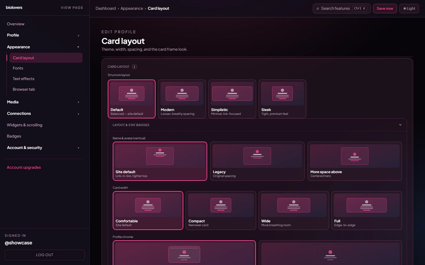
This panel sets the **overall shape** of your profile card — the structure preset, where the avatar / name sit, how wide the card is, and the card's fill style.
 **Free can use almost everything here.** The only Premium-gated controls on this panel are the **Transparent** card panel option and the **custom backdrop blur** slider.
## Structure layout
Tap one of the four preset cards. Each preset is a complete starting point.
| Preset | Vibe |
| -------------- | ------------------------ |
| **Default** | Balanced — site default. |
| **Modern** | Looser, breathy spacing. |
| **Simplistic** | Minimal, link-focused. |
| **Sleek** | Tight, premium feel. |
Picking a preset doesn't lock anything — you can override the individual controls below.
### Side-by-side: the four presets on the showcase profile
**Free can use almost everything here.** The only Premium-gated controls on this panel are the **Transparent** card panel option and the **custom backdrop blur** slider.
## Structure layout
Tap one of the four preset cards. Each preset is a complete starting point.
| Preset | Vibe |
| -------------- | ------------------------ |
| **Default** | Balanced — site default. |
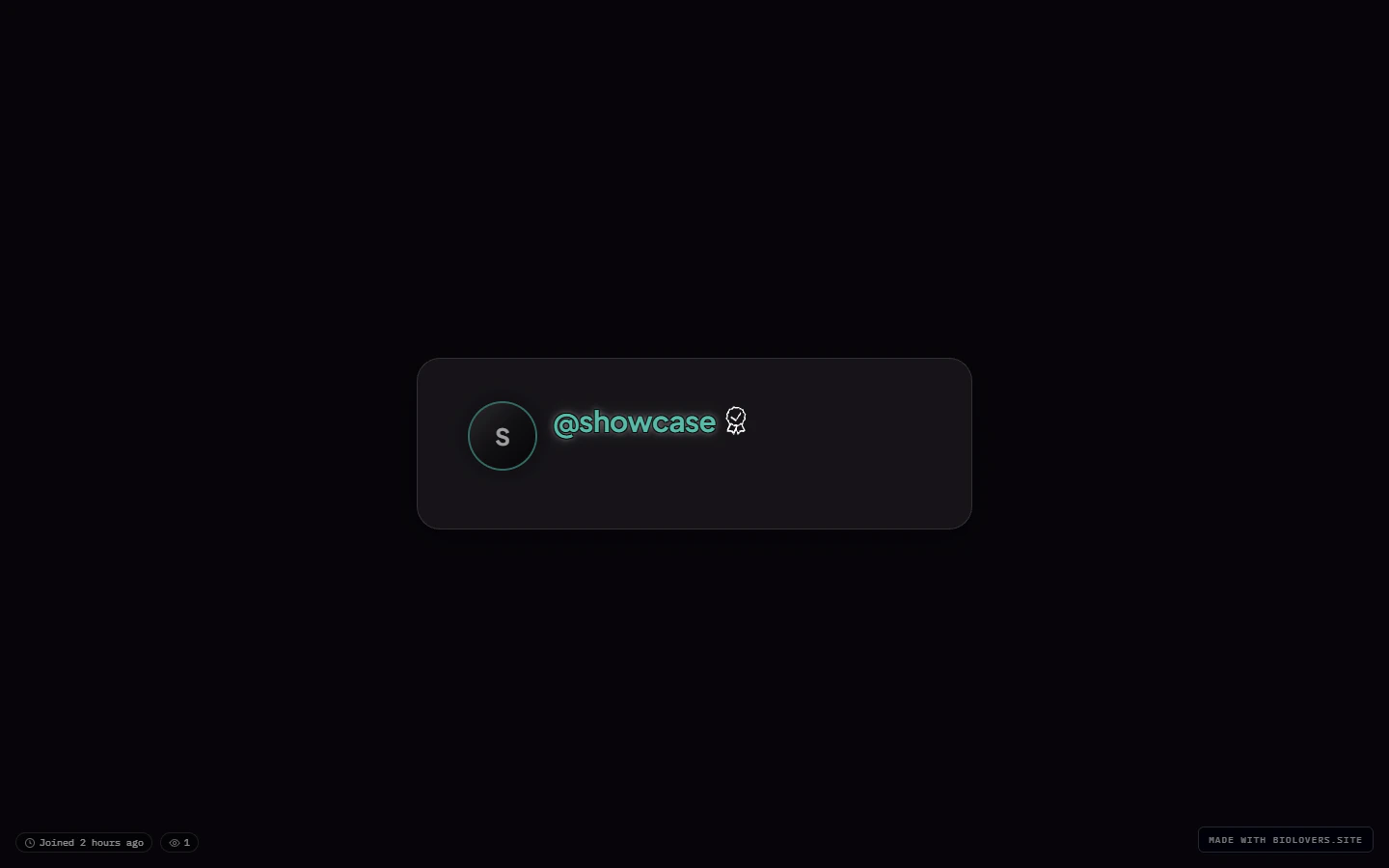
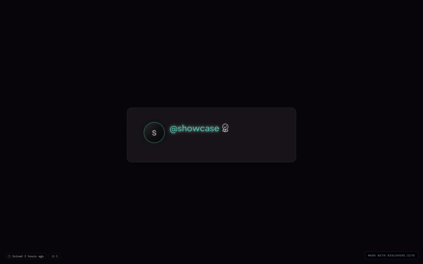
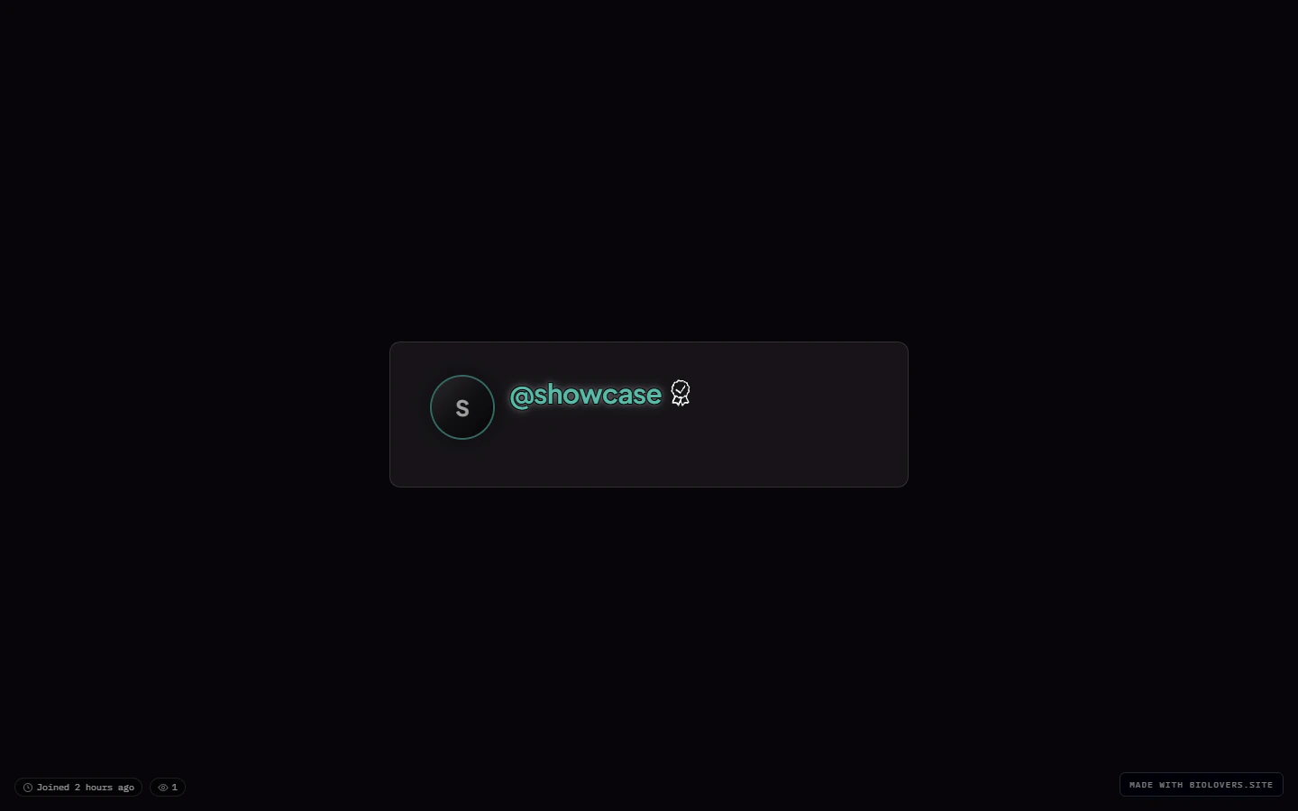
| **Modern** | Looser, breathy spacing. |
| **Simplistic** | Minimal, link-focused. |
| **Sleek** | Tight, premium feel. |
Picking a preset doesn't lock anything — you can override the individual controls below.
### Side-by-side: the four presets on the showcase profile
 ## Name & avatar (vertical)
Three options for how the hero (avatar + name) sits inside the card:
| Option | What it does |
| -------------------- | ---------------------------------------------------- |
| **Site default** | Tighter top, link-in-bio style. |
| **Legacy** | Original spacing from the early version of the site. |
| **More space above** | Centered hero with extra breathing room. |
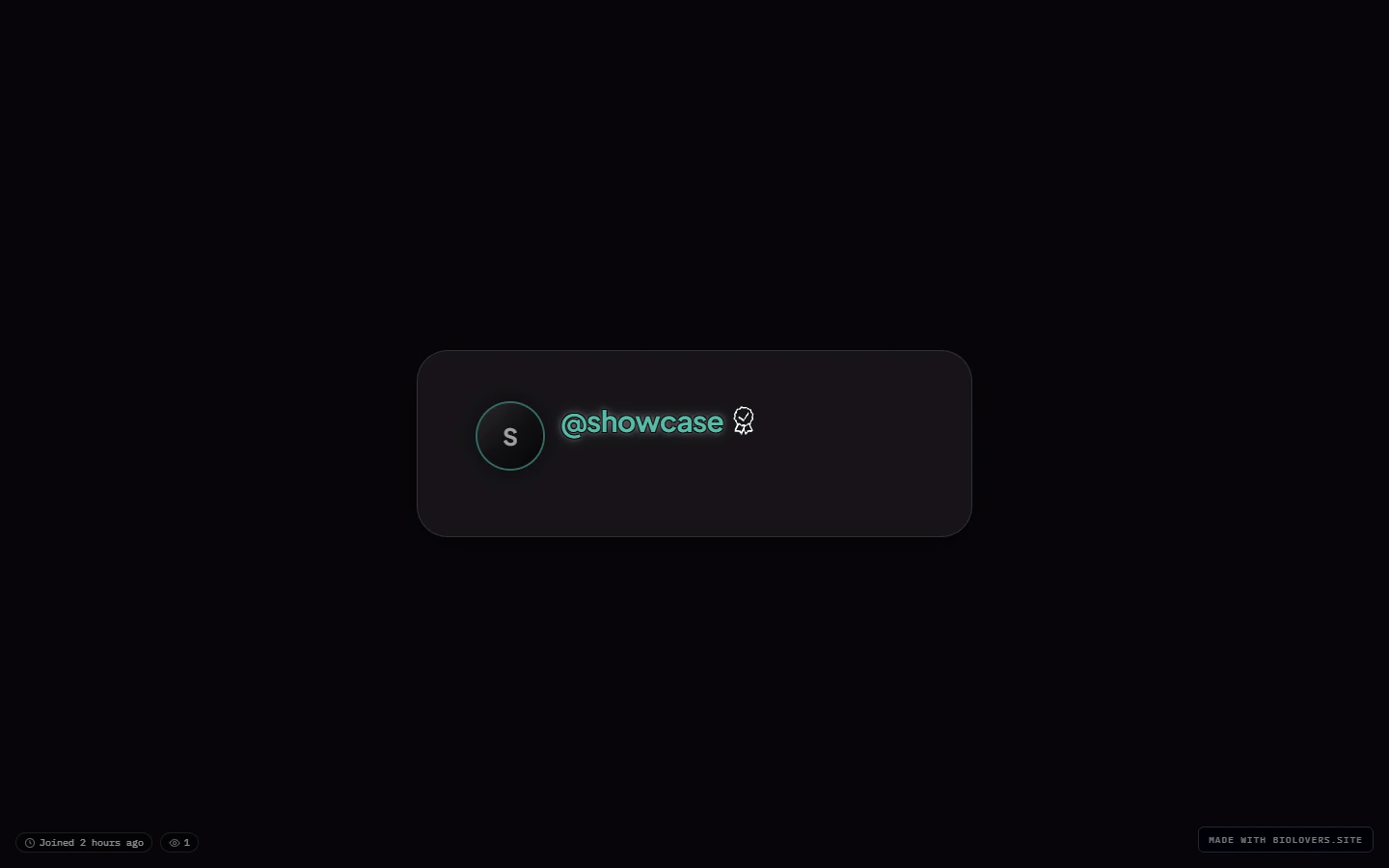
## Card width
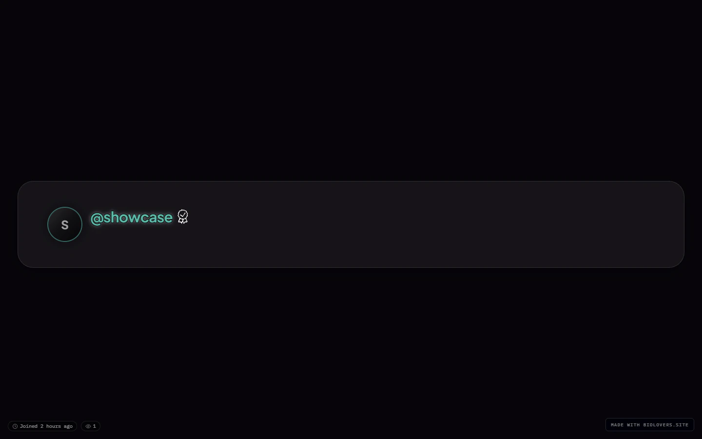
Four discrete sizes — **not** a slider:
| Width | What it does |
| -------------------------------- | --------------------------------------------- |
| **Comfortable** *(site default)* | The standard card width. |
| **Compact** | Narrower card, tighter line lengths. |
| **Wide** | More breathing room, looser column. |
| **Full** | Edge-to-edge — basically no card width limit. |
## Name & avatar (vertical)
Three options for how the hero (avatar + name) sits inside the card:
| Option | What it does |
| -------------------- | ---------------------------------------------------- |
| **Site default** | Tighter top, link-in-bio style. |
| **Legacy** | Original spacing from the early version of the site. |
| **More space above** | Centered hero with extra breathing room. |
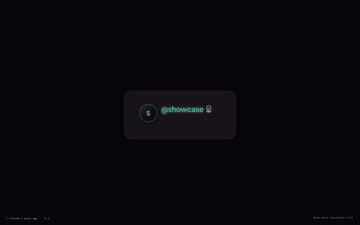
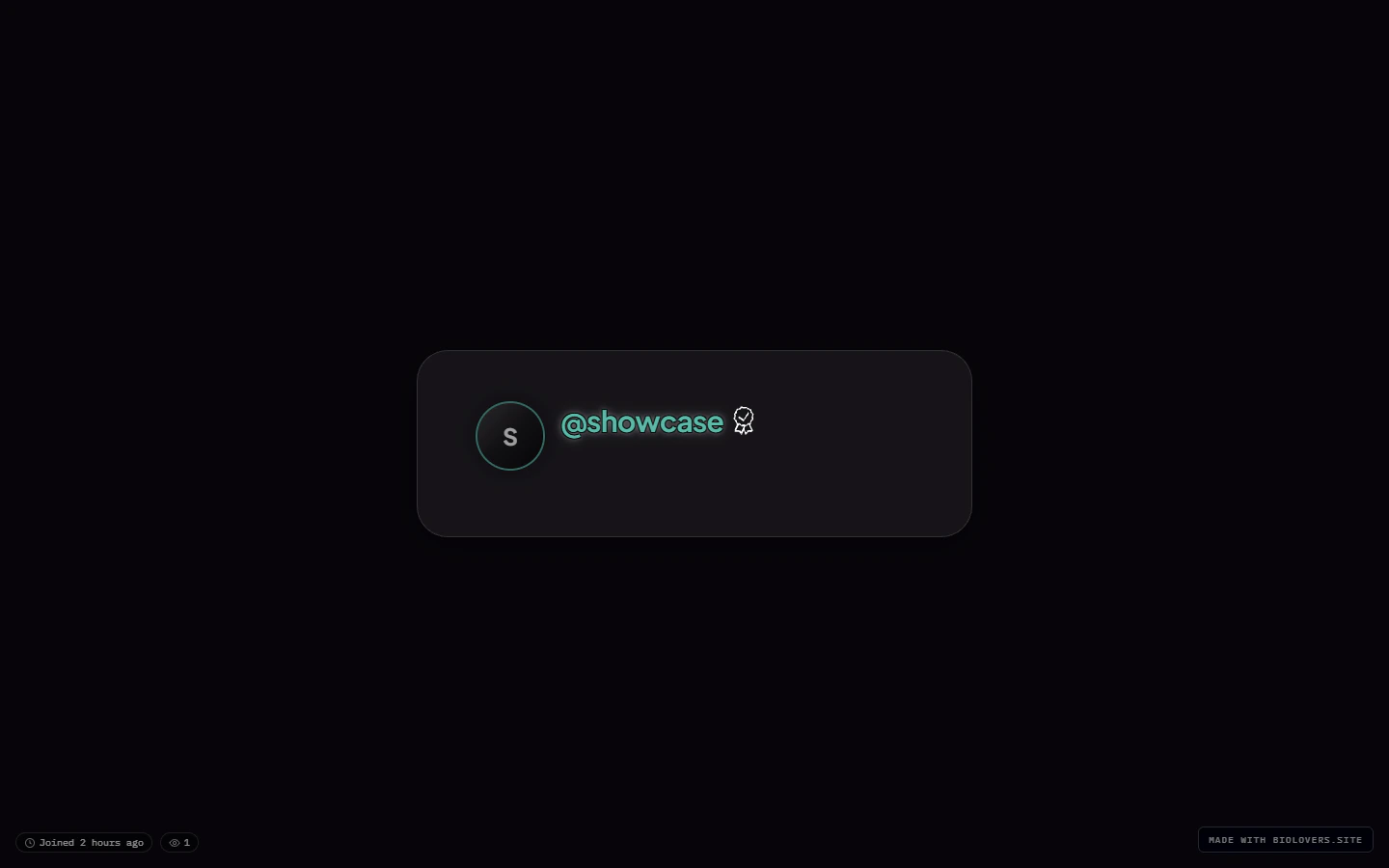
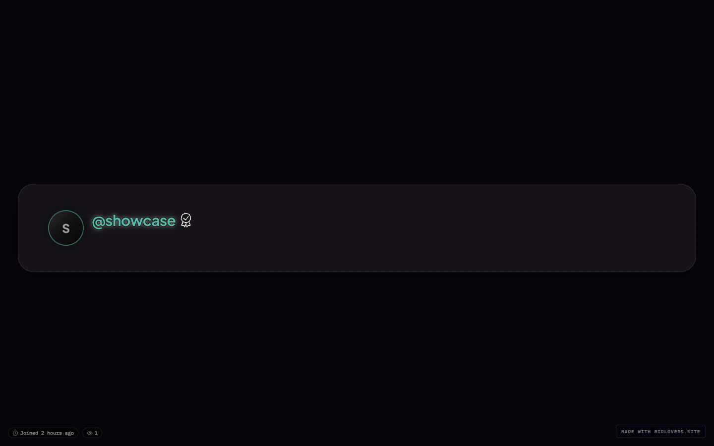
## Card width
Four discrete sizes — **not** a slider:
| Width | What it does |
| -------------------------------- | --------------------------------------------- |
| **Comfortable** *(site default)* | The standard card width. |
| **Compact** | Narrower card, tighter line lengths. |
| **Wide** | More breathing room, looser column. |
| **Full** | Edge-to-edge — basically no card width limit. |
 ## Profile chrome
Two looks for the page-level chrome around your card:
| Chrome | What it does |
| ----------- | ---------------------------------------------------------------------------------------------------------- |
| **Default** | Card has its visible frame and chip borders. |
| **Clean** | No card outline, no chip borders — text and badges sit straight on your background like a minimal overlay. |
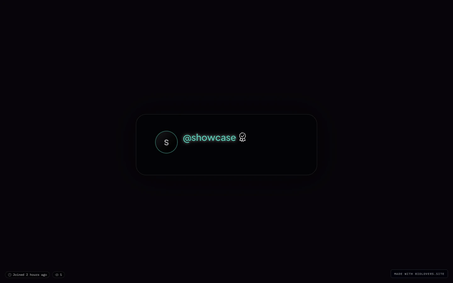
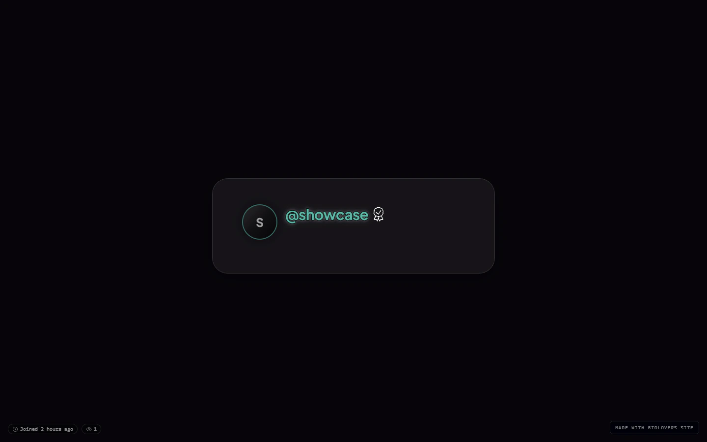
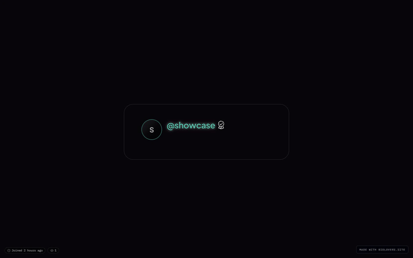
## Card panel (the fill behind the card content)
| Option | What it does | Notes |
| ---------------- | -------------------------------------------------------------------------- | ----------------- |
| **Site default** | Glass with a subtle blur — works on any background. | |
| **Solid** | Fully opaque panel — best for busy or photo backgrounds. | |
| **Glass** | Frosted, semi-transparent. Same look as the default with no blur fallback. | |
| **Transparent** | No panel fill — text and avatars float on the page background. | **Premium-only.** |
## Profile chrome
Two looks for the page-level chrome around your card:
| Chrome | What it does |
| ----------- | ---------------------------------------------------------------------------------------------------------- |
| **Default** | Card has its visible frame and chip borders. |
| **Clean** | No card outline, no chip borders — text and badges sit straight on your background like a minimal overlay. |
## Card panel (the fill behind the card content)
| Option | What it does | Notes |
| ---------------- | -------------------------------------------------------------------------- | ----------------- |
| **Site default** | Glass with a subtle blur — works on any background. | |
| **Solid** | Fully opaque panel — best for busy or photo backgrounds. | |
| **Glass** | Frosted, semi-transparent. Same look as the default with no blur fallback. | |
| **Transparent** | No panel fill — text and avatars float on the page background. | **Premium-only.** |
 ## Glass & blur (Premium)
This collapsible group has two opt-in sliders:
* **Custom backdrop blur** — checkbox to enable, then a slider from `0` to `40` px. Off uses the preset's default.
* **Custom panel opacity** — checkbox to enable, then a percentage slider for how much of the page background bleeds through.
Both are Premium-only.
## Where the accent color lives
Not on this panel. The **accent color** picker is on the [Name & about me](/profile/name-and-about) panel because it's tied to text / link styling.
## Where the page background lives
Not on this panel either. See [Page background](/media/page-background) for the image / video behind the card.
## Common questions
Switch the **Card width** to **Wide** or **Full**, or pick the **Modern** structure preset.
Open the **Glass & blur** group, tick **Custom backdrop blur**, and slide between 0 and 40 px. (Premium feature.)
Set **Card panel** to **Transparent** (Premium). Note that text legibility depends on the background — consider darkening the background or applying a [Text effect](/appearance/text-effects) outline.
Different panel — see [Page background](/media/page-background). Card layout is only the card frame.
## Related
What's behind the card.
Gradient, glow, outline (Premium).
## Glass & blur (Premium)
This collapsible group has two opt-in sliders:
* **Custom backdrop blur** — checkbox to enable, then a slider from `0` to `40` px. Off uses the preset's default.
* **Custom panel opacity** — checkbox to enable, then a percentage slider for how much of the page background bleeds through.
Both are Premium-only.
## Where the accent color lives
Not on this panel. The **accent color** picker is on the [Name & about me](/profile/name-and-about) panel because it's tied to text / link styling.
## Where the page background lives
Not on this panel either. See [Page background](/media/page-background) for the image / video behind the card.
## Common questions
Switch the **Card width** to **Wide** or **Full**, or pick the **Modern** structure preset.
Open the **Glass & blur** group, tick **Custom backdrop blur**, and slide between 0 and 40 px. (Premium feature.)
Set **Card panel** to **Transparent** (Premium). Note that text legibility depends on the background — consider darkening the background or applying a [Text effect](/appearance/text-effects) outline.
Different panel — see [Page background](/media/page-background). Card layout is only the card frame.
## Related
What's behind the card.
Gradient, glow, outline (Premium).